The Decorator's Hub
The Blog
Insider Tips for Printing Light Designs on Dark Shirts
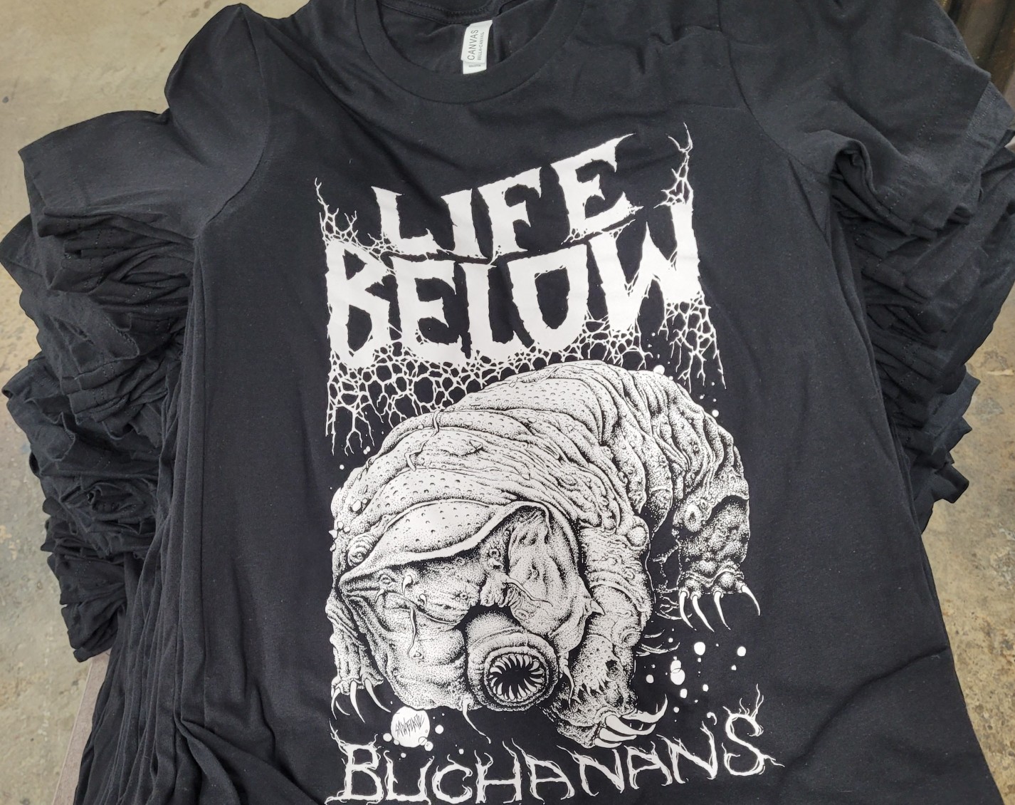
Whether you're an experienced screen printer or a newbie, learning the art and process of white prints on dark shirts has a learning curve. However, if you take the time to become an expert in turning out bright white (or lighter-hued) prints on black shirts, your happy customers will thank you. We asked five seasoned printers to show off their light-on-dark chops. Plus: insider tips for getting great results.
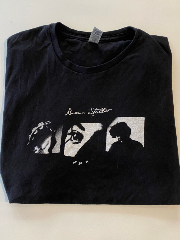
This White Print's Definitely With the Band
Being a touring musician is tough enough, but when you add in the responsibility of selling custom band merchandise, it can be overwhelming. Fortunately, the Chicago Signs and Screens team was able to help out the Been Stellar band when the crew came through Chicago. "We turned around their shirts the next day and kept them stocked up for the rest of their tour," says Mike Kupfer, co-founder. "Additionally, we used a halftone print process and recreated photos with rich halftone textures for Been Stellar's print. It's safe to say they were highly satisfied with our ability to deliver promptly and keep their merch table stocked!"
It's Always a Beautiful Day With Pink Designs
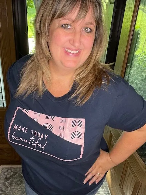
Misti Money, owner and designer at 6Money's Creations, created this pink-on-navy blue design for her T-Shirt of the Month Club that sends women across the country freshly designed t-shirts 12 times a year. "This 'Make Today Beautiful' t-shirt is exclusive to our club members," she says. "Our members loved that the design wasn't solid, and offered an updated look to what could have been a traditional, boxy design."
Money chose a solid navy short-sleeve t-shirt to pair with the design's lighter pink shade. She used her white toner printer for this design since it helped her achieve the exact pink tone she wanted. "The printer places a base of white toner on the designs, which helps us not have to worry about dye mitigation or fear of the dark color showing through on the lighter-colored design," she says. "Using this equipment also saved us time and labor costs, since we only had to print and marry the designs."
Pro tip:When you're creating a white or light-colored design, think of ways to add interest and different elements to a design. "It's a great way to get an edge over your competition," Money says. "We can increase the perceived value of an ordinary t-shirt with a retail design."
The Profit's in the Details
Eric Solomon, owner at Night Owls Print Shop, shows off two examples of a white discharge ink print on 100% cotton t-shirts. "Discharge ink works by replacing the dye of the garment with specifically formulated ink," he says. "For these two customers, we used a white discharge ink to get a very bright, and soft white print."
Pro tip:You can get very detailed prints using a 157, 200 or even 230 thin thread screen with a white or light discharge ink.
These White Prints Stand Out From the Pack
LaTonna Roberson, owner of T-Shirt Shop Dallas and Lady Print Boss Consulting, turns out fantastic white prints on black shirts that her diverse client base loves.
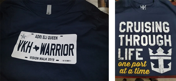
Here's a rundown of four recent white prints her team produced:
- Roberson's team printed the "Cruising through life one port at a time" message using a 156 mesh screen on basic black t-shirts. "When you add a grunge effect to a white design, it gives the shirt a lot of character," she says.
- The "Warrior Vision Walk 2019" license plate design used the shirt color as the lettering. "We printed the white ink with two passes of a 156 mesh screen to give it a nice bright white," she says.
- Roberson's team added a small amount of puff ink to the "Vibe City Church Logo" design so that it appears raised on a premium Next Level Unisex Cotton T-Shirt. "We printed it on a Workhorse automatic press using a 110 mesh screen," she says.
- T-Shirt Shop Dallas turned the "1900" design into a vintage-looking white print from a customer's pencil drawing. "We converted the drawing to digital art, and defined a few of the lines so we could get the details to print," Roberson says. The team converted the design to a one-color halftone and ripped it at 45 degrees. Then, they manually screen printed the shirts with a 230 mesh screen.
A Next-Level Design for Next-Level Firefighters
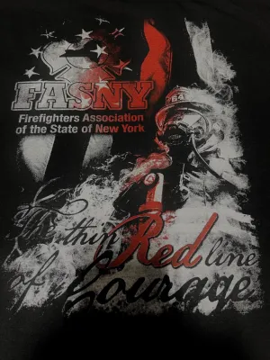
The 45,000-member-strong Firefighters Association of the State of New York relies on Howard Potter, CEO of A&P Master Images, and his staff to create standout t-shirts for their members. The team used the shirt's background in the "Red Line of Courage" artwork to bring the design to life. "That's the amazing part of halftoning a photo to screen print it," Potter says. "Then, we used the red to symbolize the firemen, and to draw your eye in."
A&P Master Images started working with FASNY about a year ago. "They're really great people, which makes us want to go over the top for every design they need done," Potter says. "They want designs that take it to the next level to inspire their members and the community."
Pro tip:Use Adobe Photoshop to create your halftone dot matrix, and use no less than a 230 mesh screen. "The higher the mesh, the finer the detail you can pull from the dot matrix of the image to give it a cleaner look," Potter says.
Tractor Supply Gets Dimensional
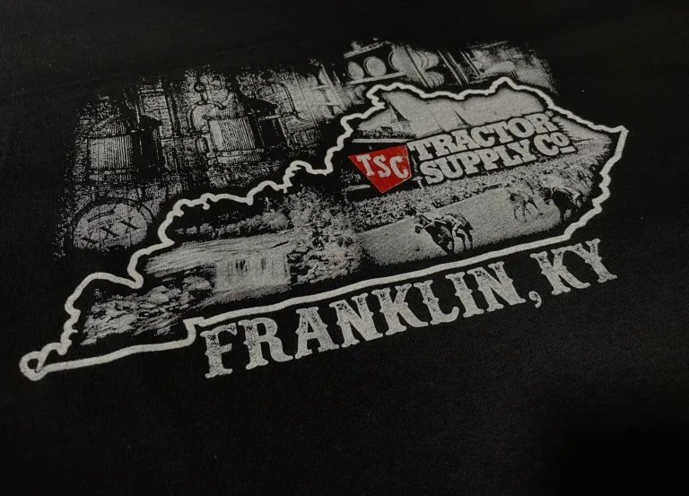
The A&P Master Images team created this white-on-black print for a Tractor Supply distribution center in Kentucky to give to people throughout the state. "The white technique I used on this was a complete halftone design," says PJ Loomis, design manager at A&P Master Images. "We used one screen for the border of the state. Then, we needed another screen for all of the white detailed images. Lastly, we used one red screen for the color splash."
To create a highly detailed halftone screen print, remember that the imprint always looks best digitally on screen, even after it's been separated and rendered. "The real trick is before making the dot matrix, right before you bitmap the design to create the points, you must burn and dodge the areas of high detail, with it in grayscale," Loomis says. The goal is to get a high contrast with the details so the image pops out, and doesn't look "muddied" when printed. "Sometimes, you need to overcompensate the details in a halftone design to achieve the correct look," he says.
Pro tip: Loomis used the state border outline by itself to make it a brighter, more solid print than the rest. "This technique produces the effect of a 3-D border for better depth and dimension in the design," he says. "If you keep the high details more faded than the border, you can achieve this look!"
Light-on-Dark Tips to Keep in Mind
If you're new to white prints on dark shirts, here are a few tactics to remember. Of course, as you develop your own skills, you'll figure out what process works best for you and different jobs.
- Use a lower mesh count. Try well-tensioned screens between 110 and 195. The higher the mesh count, the less ink you'll waste.
- Choose specific emulsion and white ink. Try using an emulsion with a high solids build. Pick a white ink that's opaque and easy to work with, so that it's not so thick. Stir it well when you're ready to use it. Otherwise, store your ink container at room temperature.
- Build up your ink layers. On your first pass, your white ink may not completely cover your dark shirt. On your next pass, after you flash your first print, you'll add another layer to create the top layer or overprint. This step takes practice, so build in time to learn white-on-dark printing before you start offering it to clients.
- Keep on printing! Don't be shy about asking other screen printers for pointers on white prints on dark shirts. That way, you'll be ready to offer your customers this great option sooner, rather than later.