The Decorator's Hub
The Blog
Get Inspired By These Eye-Catching Half-Tone Designs
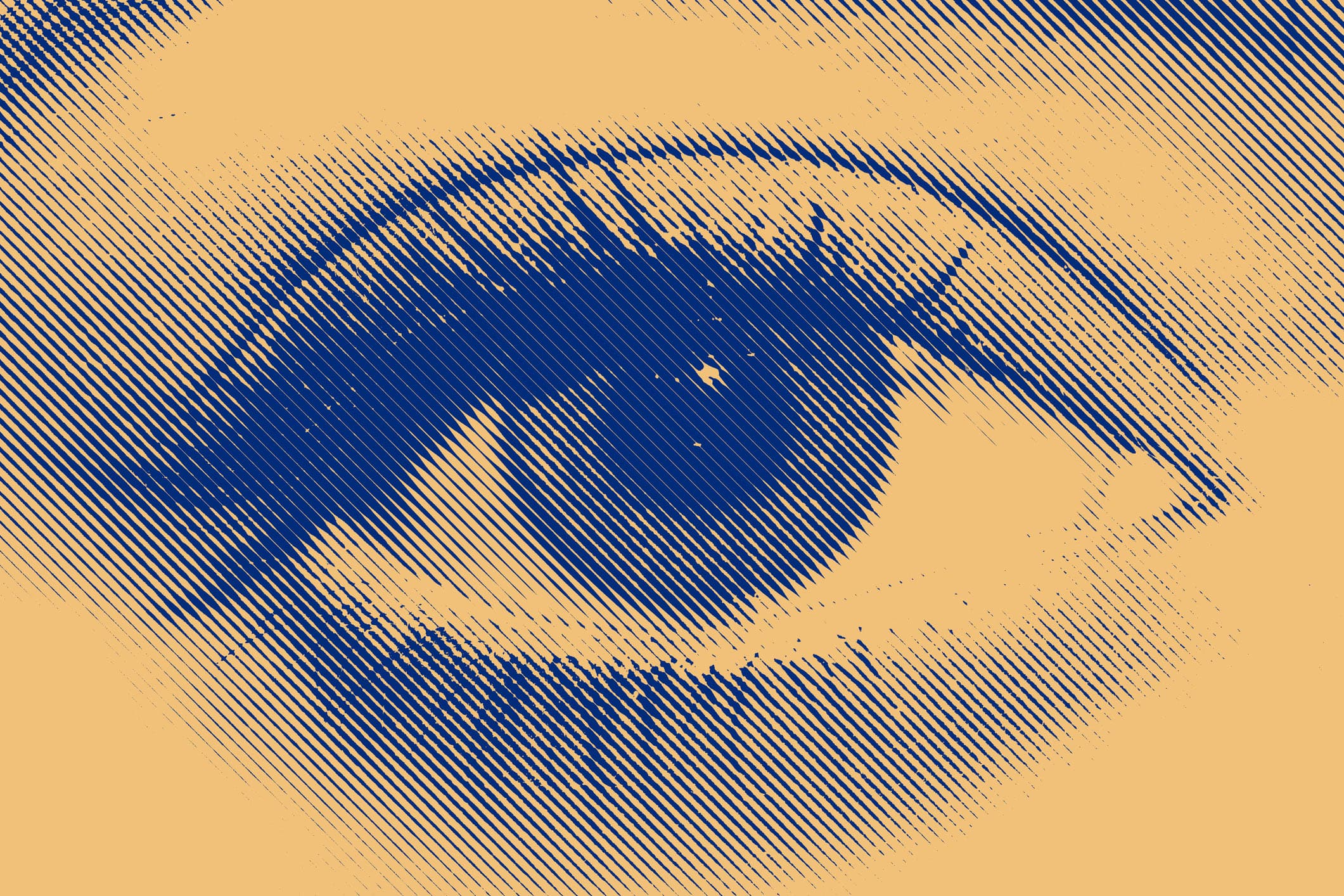
In your printing print shop, half-tone screen printing can open up lots of new opportunities for very detailed, photo-realistic prints. While mastering half-tones does come with a learning curve, it's worth it, as you'll wow your customers and attract new ones to your shop.
Here's a quick overview of half-tones if you're new to the technique: If you want to print great half-tone prints, you need to start with high-quality artwork that you've formatted for screen printing. Then, you expose a solid stencil on the correct screen, and use printing techniques that lay down precise ink dots to create your half-tone print on a t-shirt.
We asked shops turning out some of the best half-tone designs to share examples of their work, along with detailed, insider tips to achieving great results.
'Shoot for the Moon' and Beyond
A student at John D. George Elementary School in Verona, NY, created this fun "shoot for the moon artwork" in color. The team at A&P Master Images recreated it to work for screen printing as a one-color, half-tone print. "Jobs like this allow students at a young age to see their artwork come to life, from being on a piece of paper to printed on a t-shirt they can wear," says Howard Potter, CEO of A&P Master images.
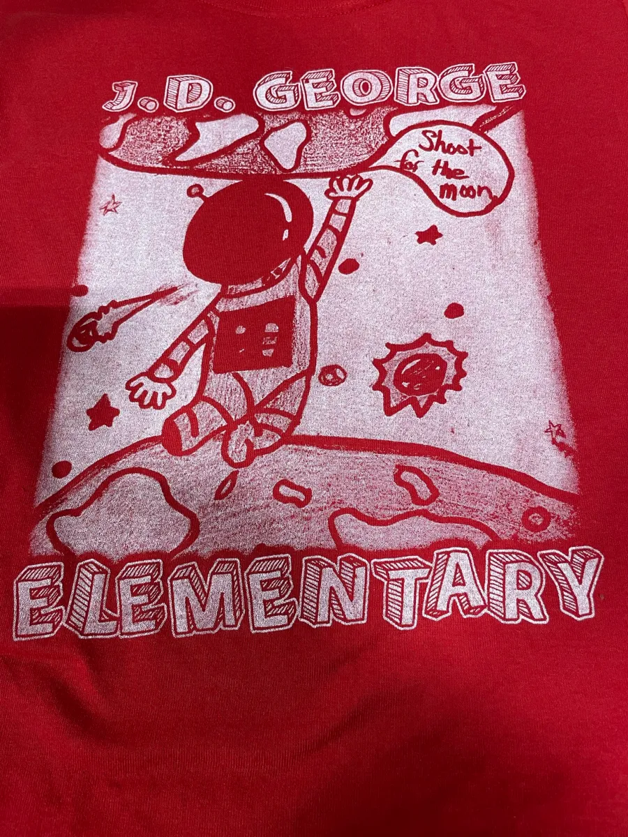
Pro Tips: When it comes to screen printing half-tones, you can achieve a lot of different looks based on the t-shirt fabric, dot size, type of ink, how many layers of ink you use, and more. "Early on in our shop, we did a lot of experimenting with half-tone screens," Potter says. "By doing this, you can learn so much more, so much faster. Run your different ink colors through with and without a base. See how they react and examine the look they create. Mess around with the amount of ink layers you apply. Create screens with different patterns and test them. That way, you expose yourself and your staff to so many more possibilities when printing half-tones."
Proud of Our K-9 Unit
The Utica, NY-based A&P Master Services team created this cool half-tone t-shirt design for its local police force's K-9 Unit. "Our customer wanted some cool shirts to rep their unit while they train, which transition well into civilian-wear," says J'nelle T. Nuborazek, customer service manager. The client wanted a vintage look to their design, without sacrificing the details.
"We received the image as a reference point, so we recreated it and added effects to give it more depth," says Hannah Millard, designer. The A&P team took the original vector image into Adobe Photoshop and added grunge effects. "From there, we split the file so it could print as multiple colors that we half-toned into the dot pattern," she says.
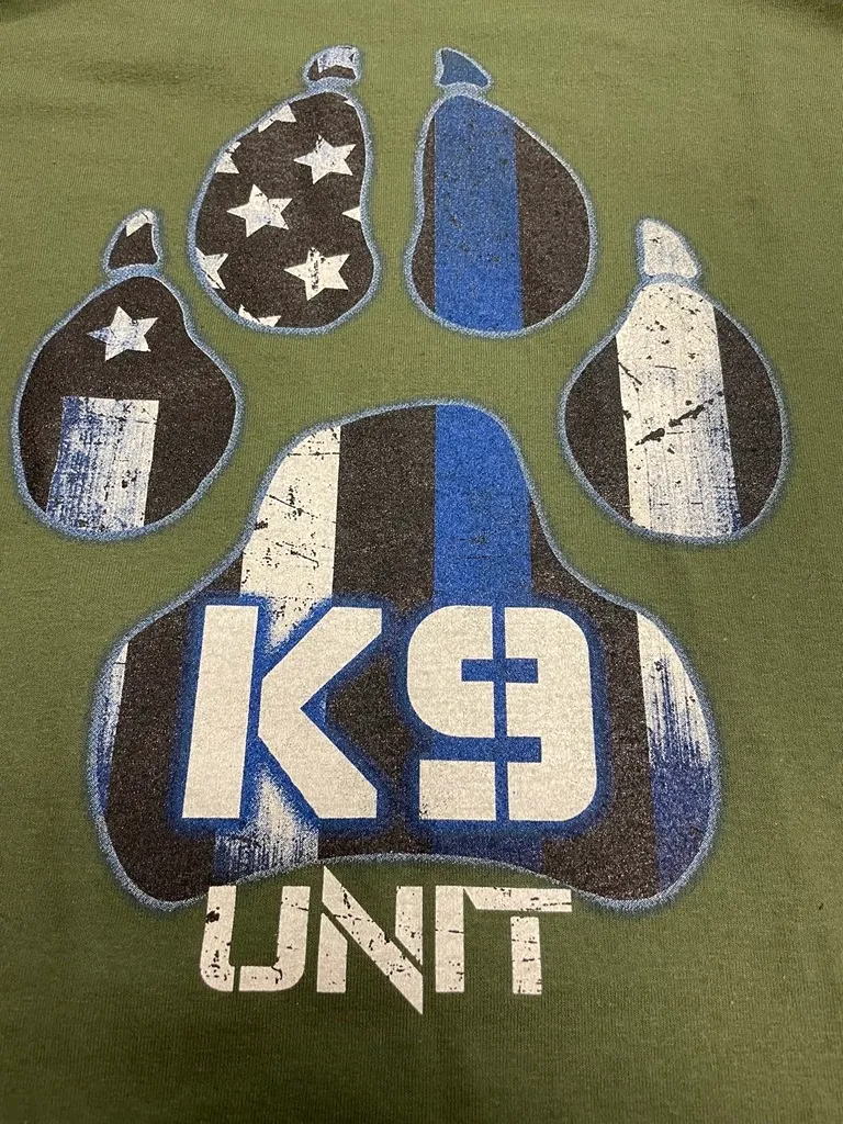
Pro Tips: "One of the keys to having a great half-tone design is having a great starting image for your designers to work from, especially when small intricate details can make or break a design," Nuborazek says.
Fighting Fires Since 1901
The New Hartford Fire Department wanted a new t-shirt design that also paid homage to their past. The fire department gave the A&P Master Images team a high-resolution reference image of an original truck and hose used from back in 1901 when the department started.
"Our designers Photoshopped this image to pull the subject out of the background," Millard says. "Then, we added vectors to create the design layout. We used various overlaid effects to bring out the highlights and shadows of the image, and to create a half-tone in one color. We added a creative font to give the design the vintage feel our client wanted."
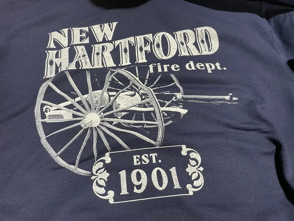
If you're working from a photograph, Millard points out that if you create a high level of contrast and brightness, it'll result in a better half-tone design with texture.
"Half-toning is a complex process but, when it's done right, you can successfully create intricate and detailed designs even when you're working with one to three colors," Millard says.
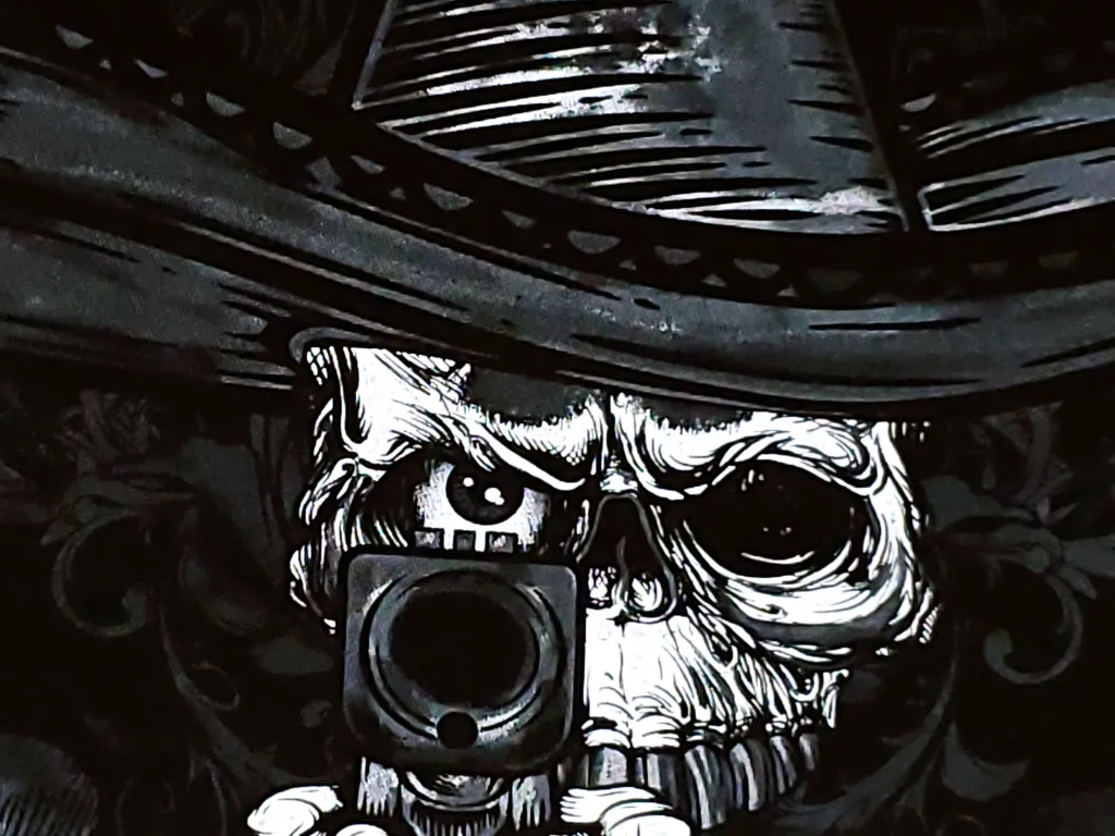
HA Federal Firearms Program
Charles Juarros, owner of Ragged Apparel Screen Printing, created this design for a federal law enforcement agency's firearms program. "I designed this half-tone design to be opposite of the 'typical' government agency shirt and have a more artistic look," he says. "I incorporated different elements that reflected the culture of the agency's New Mexico location."
Drilling down, Juarros drew the striking design in Photoshop, using a hard charcoal brush. He laid down the base outline in a light gray. Then, he used different grays and whites with Photoshop's multiply and overlay modes to add the highlights, shadows, textures and dimension. Next, he used Separation Studio to create the separations. Finally, he printed the film positives with AccuRIP Screen Printing Software with a 61-degree angle and 55 lines per inch.
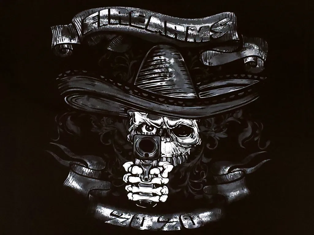
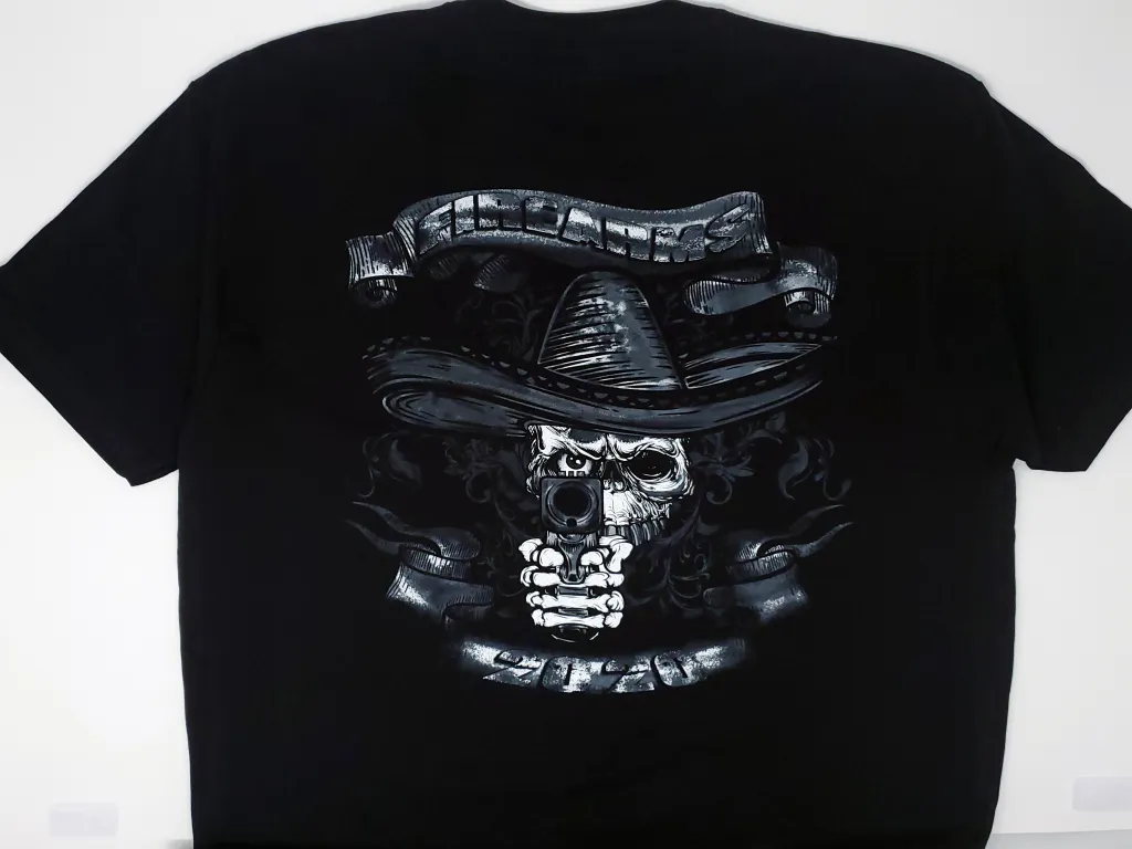
"We printed this design with only two screens," Juarros says. If you want to know some of the technical specs and ink types to produce this design, you're in luck: Both screens were Newman Roller Frames using a 230-thread-count, SAATI HiTex mesh, tensioned at 30 newtons. The team used ICC Dark Grey and ICC Legacy White, and mixed both inks with Wilflex Soft Hand Base. "We utilized the Dark Grey ink as a base for the highlight Legacy White," he says. "We printed a single stroke on the gray, flashed and then did a single stroke of the white highlight."
Screen Printing Badass Competition
Watch the Ragged Apparel Screen Printing team break down how they created this "badass" half-tone design in this video.
This delightful half-tone image was Ragged Apparel Screen Printing's winning entry for the Screen Print Badass Competition, held by Shirt Lab Tribe. The contest required nursery rhyme-themed designs, so Juarros' team chose "The Cat and the Fiddle." "I wanted the design to have an artistic feel with crazy lines," he says. "The main characters are skateboarders against an old London backdrop pulled up into space."
One of the keys to having a great half-tone design is having a great reference image for your designers to work from, especially when small intricate details can make or break a design.
J'nelle T. Nuborazek, A&P Master Images
Juarros worked on the design in Photoshop. "We had to incorporate several elements into the design per the contest rules, including a specific .JPG image and the Shirt Lab Tribe logo, and then printing a specific Pantone color," he says. "The design also had to be a specific size and be printed on a Fruit of the Loom Iconic T-Shirt the contest provided."
In Photoshop, Juarros started with a light gray sketched outline, and then added the coloring, textures, highlights and shadows using different brushes, and the overlay and multiply modes. Like the team's other half-tone design, he used Separation Studio to create the separations, and printed the film positives with AccuRIP, using a 61-degree angle and 55 lines per inch.
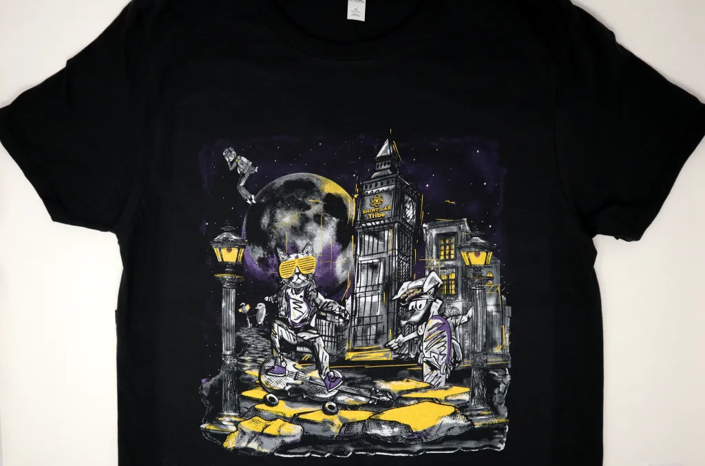
"We printed this design with four screens," Juarros says. All screens were Newman Roller Frames using SAATI HiTex mesh, with a 230 thread count, and tensioned at 30 newtons. The team used ICC Dark Grey ink as a base, flashed, and then used ICC Yellow Gold, Union Deep Purple and ICC Legacy White (for the highlight). They mixed all the inks with Wilflex Soft Hand Base.
Pro Tip:The biggest tip Juarros offers for printing half-tones well is starting out with good artwork and making good screens. "If your prepress processes aren't on point, then you'll never achieve a higher level of half-tone printing," he says. "This includes the reclaim process, and making sure you properly degrease the screens. You need to have good coating procedures and use a high-quality emulsion. You need to have high tension on your screens, since your screens are the most important part of your printing process, as they create the image. Finally, if your screens aren't at a high standard and quality, your print won't be either."
A Scottie Dog With a Hip-Hop Vibe
Heather Streible, co-owner at Replica Screenprinting, created this head-turning design for the Kentucky-based Glasgow High School's Glasgow Scotties as a fundraiser in 2021. "They were going for the rapper Notorious B.I.G's vibe," she says.
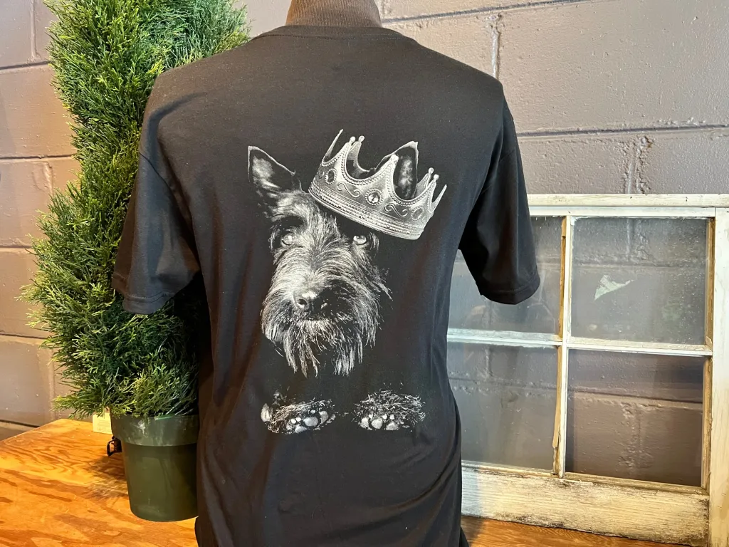
The Replica team printed this half-tone print using 55lpi UnderBase white (SAATI 150-count thin thread mesh), Gray, and Highlight White (SAATI 230-count thin thread mesh).
Pro tip: "Exceptional half-tone printing starts with great art and separations," Streible says. "When you print half-tones, you have to know how much dot gain you'll get on press and then adjust your separations accordingly. In our shop, we find using thin thread mesh screens lets us hold the incredible detail while giving us the coverage we want."
Happy Halloween, From KISS
Imagine how it would feel to print a Halloween t-shirt for KISS, one of the most influential rock bands of all time-these made-up Goth rockers have sold more than 75 million records worldwide and earned 30 Gold albums, the most out of any U.S. band. That's what happened to Night Owls Print Shop, when Epic Rights asked them to print this KISS Halloween Zombies design as part of the band's 2020 Halloween apparel line.
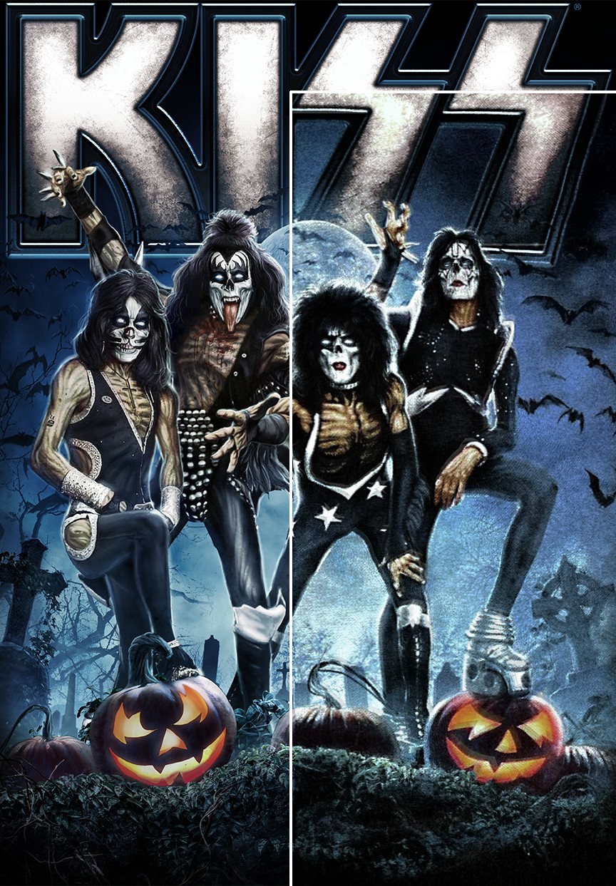
"I was stoked to be involved in KISS' merch," says Kyle McCoy, a designer in Night Owls Print Shop's art department. "I separated this cool artwork using a simulated process technique intended for high-solids acrylic ink on black garments. Once I'd separated the artwork into eight channels, I bitmapped to a 55 LPI, amplitude-modified, Euclidean dot set to 22.5 degrees for all channels."
McCoy notes that linearization is the "skeleton key" for all half-tone prints. "Even the best printers using the finest prepress and on-press practices will struggle with result-altering dot gain and loss," he says, "unless they apply quality linearization curves before bitmapping to the selected half-tone specifications.'
If your prepress processes aren't on point, you'll never achieve a higher level of half-tone printing. This includes the reclaim process, and making sure you properly degrease the screens. You need to have good coating procedures and use a high-quality emulsion.
Charles Juarros, Ragged Apparel Screen Printing
This all comes down to variables in the print method, McCoy notes. "That's because UV energy loves to creep around film positives," he says. "Gaskets love to clog with drying ink. Wet ink loves to expand on the substrate. Ink loves to flow between connecting dots to create midtone jumps. It's important to correct for these variables using linearization curves to achieve on-press what we're seeing on-screen."
If precision is a printer's primary goal, they can gather linearization curve data by using a reflection densitometer to read swatches of varying densities from an ink-on-substrate test print. "A bootstrapping, budget-conscious printer might alternatively gather linearization curve data with a keen eye and a ruled loupe," McCoy says, "comparing swatches of varying densities from an ink-on-substrate test print against the test print's bitmap."
"Whatever the method, linearization is a massive game changer that often gets overlooked by so many independent printers," McCoy continues. "It's important to ask: How are things changing between the separation file and the final print? Why are these changes occuring? How do we measure those changes and adjust for them as simply as possible? That's the crux of linearization."
Ernest Gets Scared Stupid... on a T-Shirt
The Night Owls Print Shop printed this design for Uglie Kids Club as a limited-edition, 100-piece tee paying homage to the "Ernest Scared Stupid" movie. "Uglie Kids Club always releases phenomenal pieces that let me play with unique print methods to complement their art," McCoy says. "To work with the stippled art style, I opted for a 10-channel, frequency-modified, index separation with a 170-micron diameter dot in Adobe Photoshop."
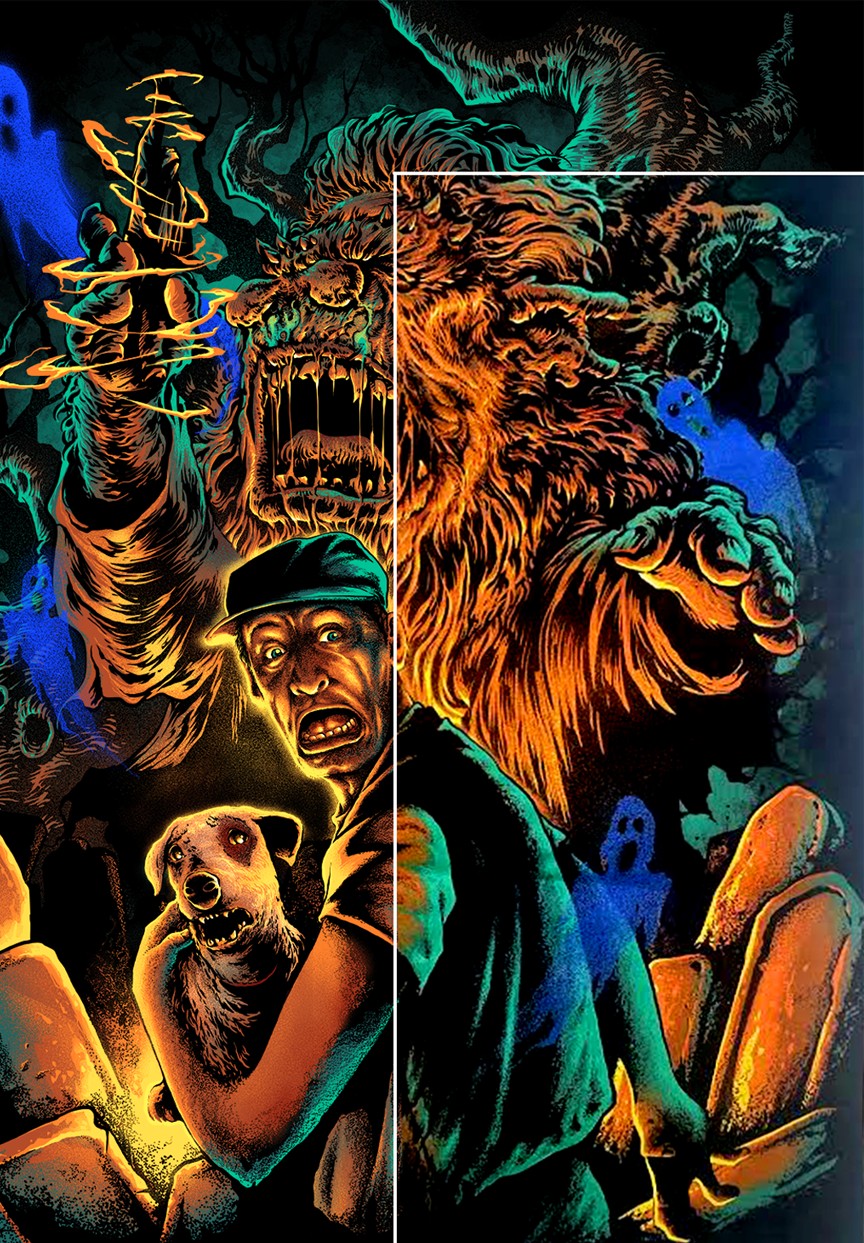
Pro Tip:To produce a great print with frequency-modified dots, McCoy says that a screen printer should know whether or not their screens can hold the micron diameter of their selected dot size. "In most cases, printers should use a minimum dot size roughly equal to the size of their mesh opening plus one and a half times the diameter of their mesh," he says.
For example, here's what the math looks like when McCoy uses his shop-favorite 230.4 mesh:
25,400 / 230 + 1.5 x 40 = 170.43 microns
"That equation is the microns in an inch divided by the mesh's threads per inch, plus one-and-a -half times the mesh diameter, coming out to 170.43 microns," McCoy says. "You'll then want to make sure your image is set to the proper PPI (pixels per inch) before indexing so that each pixel represents a dot no smaller than 170.43 microns. You'd determine this by dividing the number of microns in an inch by your pixels per inch."
An example following the previous math's logic would look like this: 25400 / 149 = 170.46
"Set your art to 149 PPI before indexing and you have a 170.46-micron diameter dot that will hold in your 230.4 mesh, if you're coating and exposing properly," McCoy says. "Combine these steps with proper linearization and you're that much closer to getting good half-tone prints every time using every method. To me, that's the coolest thing about printing: It's a field where art directly collides with STEM in endlessly fascinating ways."
Get Excited About Half-Tones
The shops we've featured shared some of their best half-tone screen prints, with an insider look at how they achieved those designs. If you're looking to up your half-tone game, it's time to turn up the half-tone heat in your shop.